
Boston Philharmonic
Multiple seasons each branded with a unique visual twist.
COMPANY: Sametz Blackstone
TEAM: Alex Budnitz / Art Director, Sara Hartleben / Designer
SCOPE: Identity, Print & Digital Design
Overview
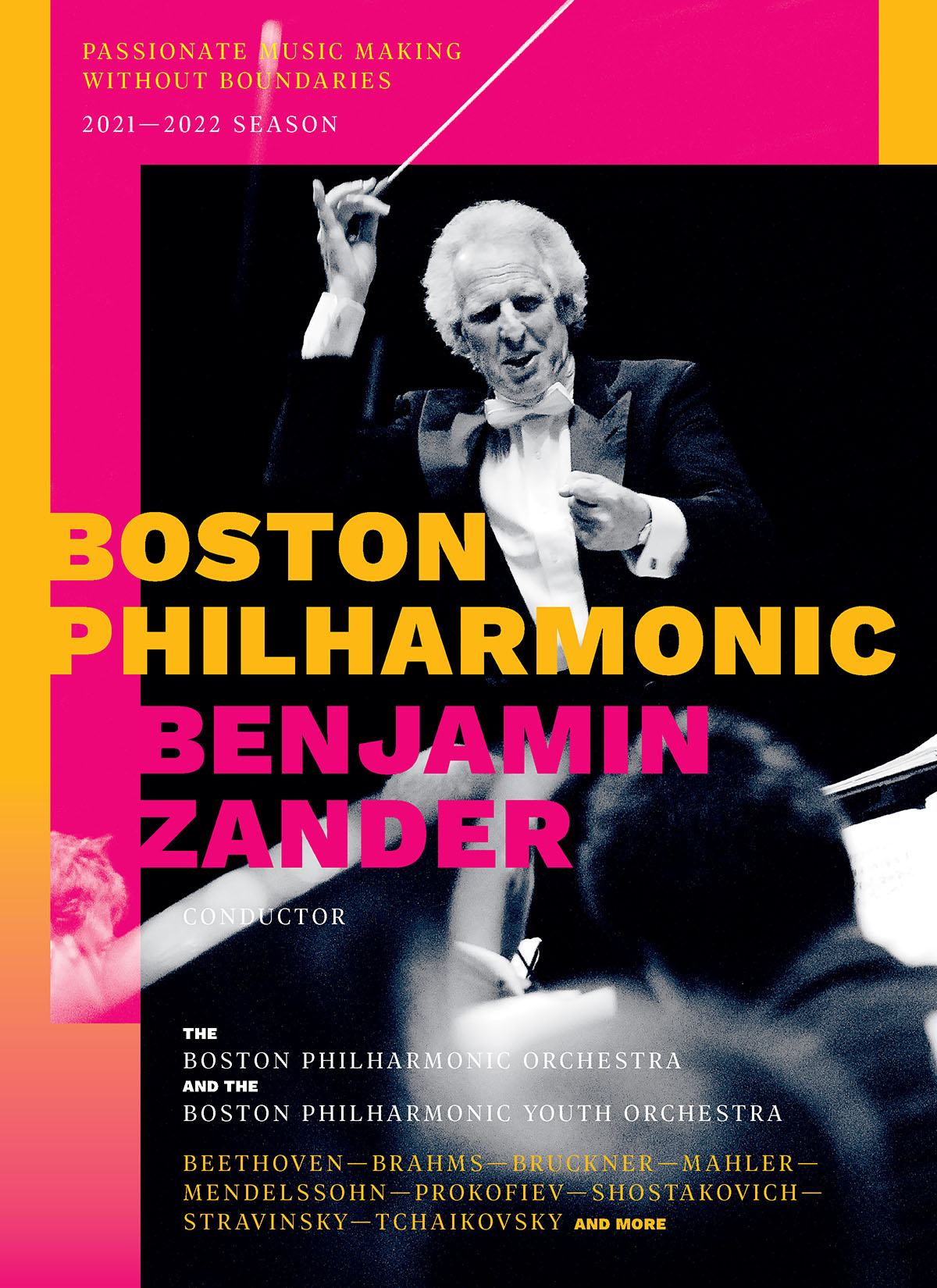
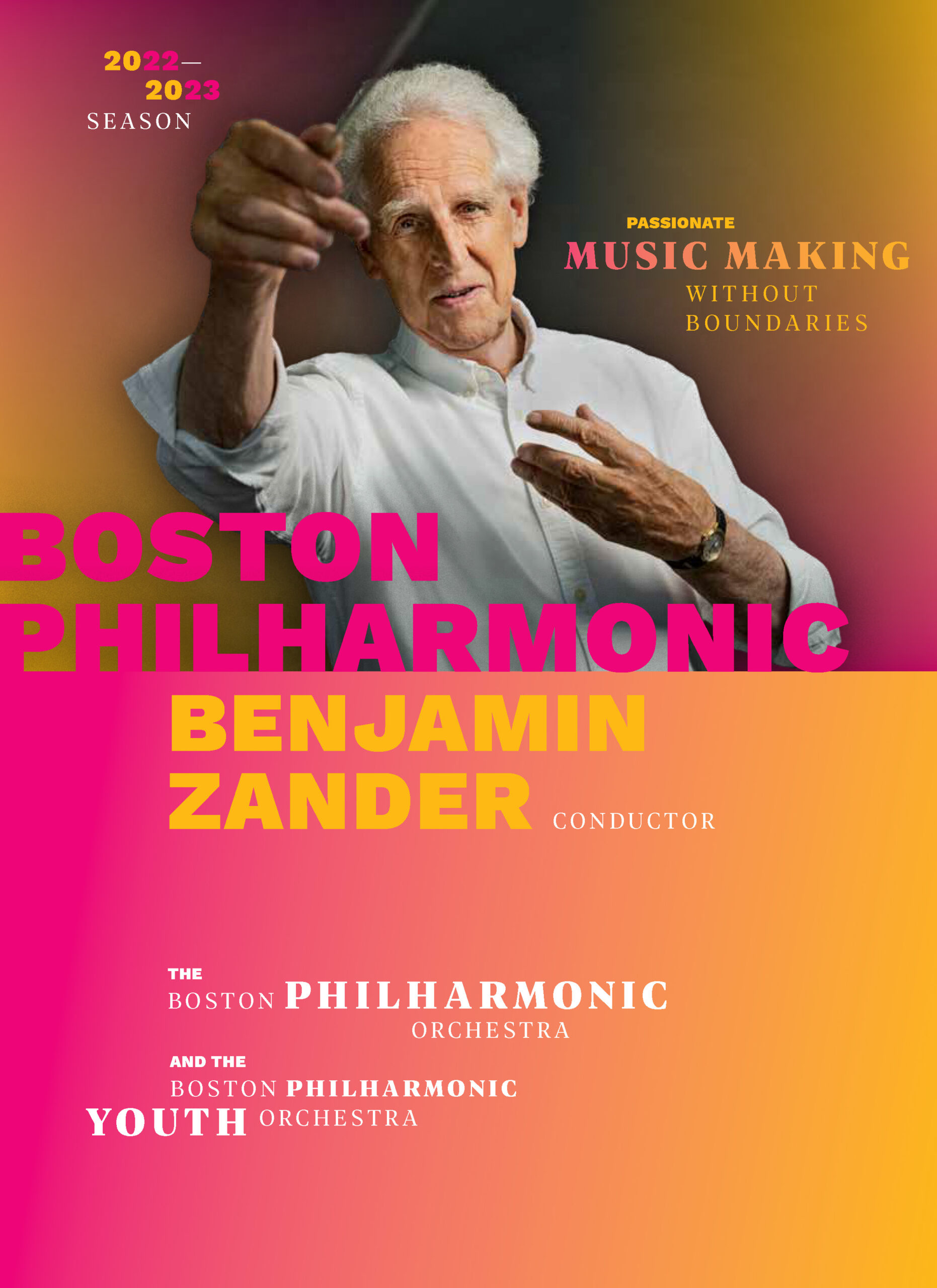
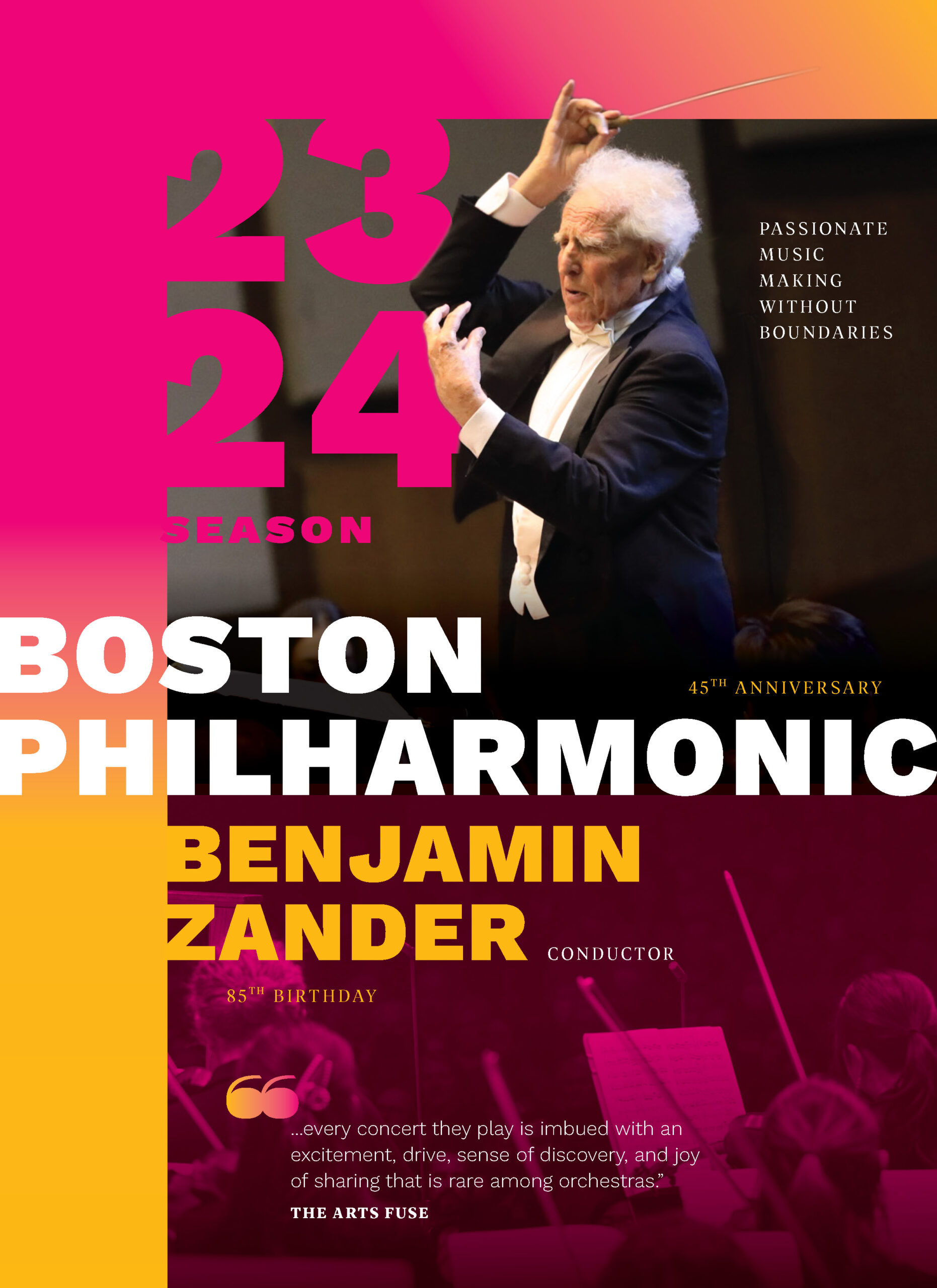
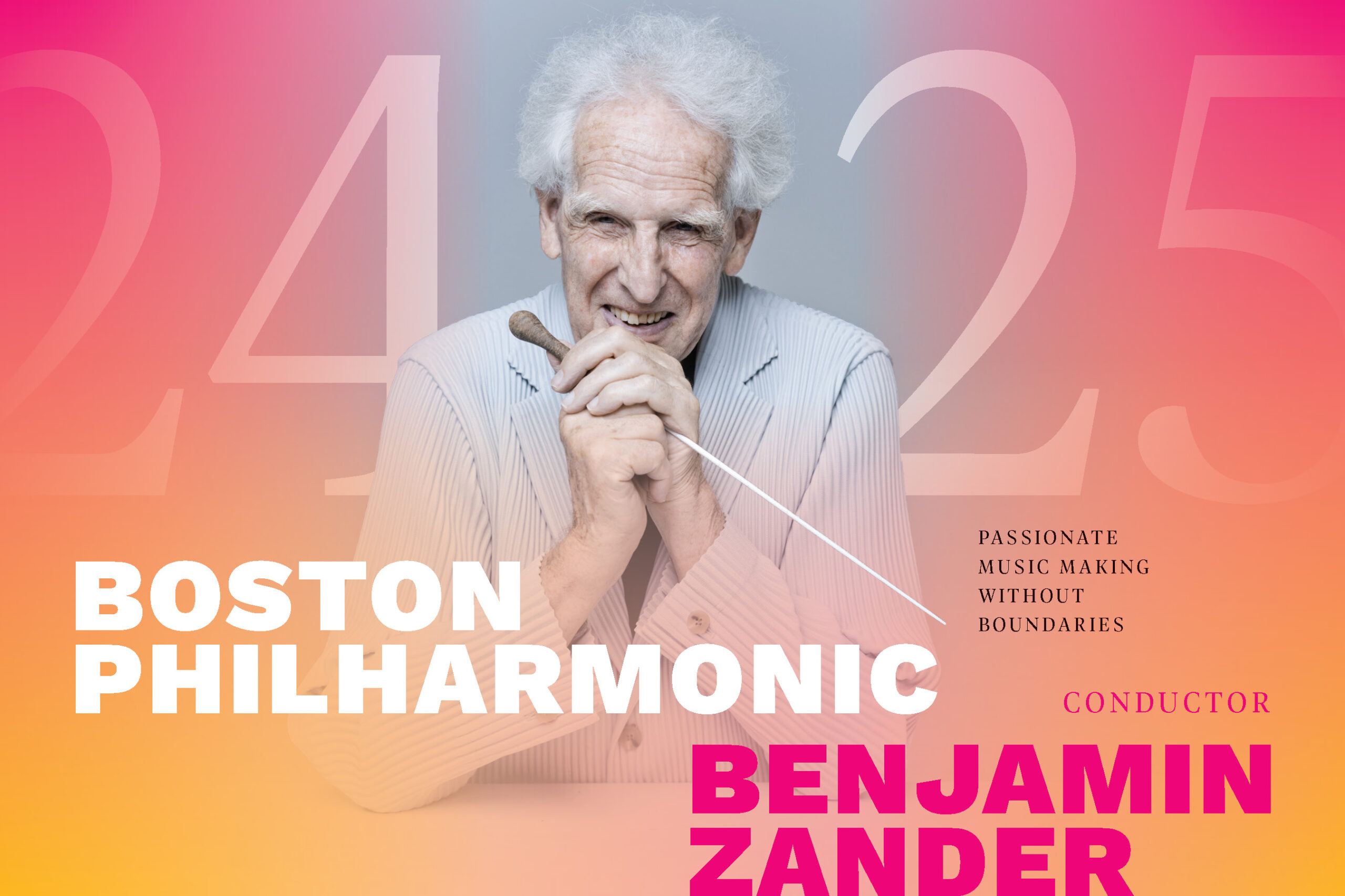
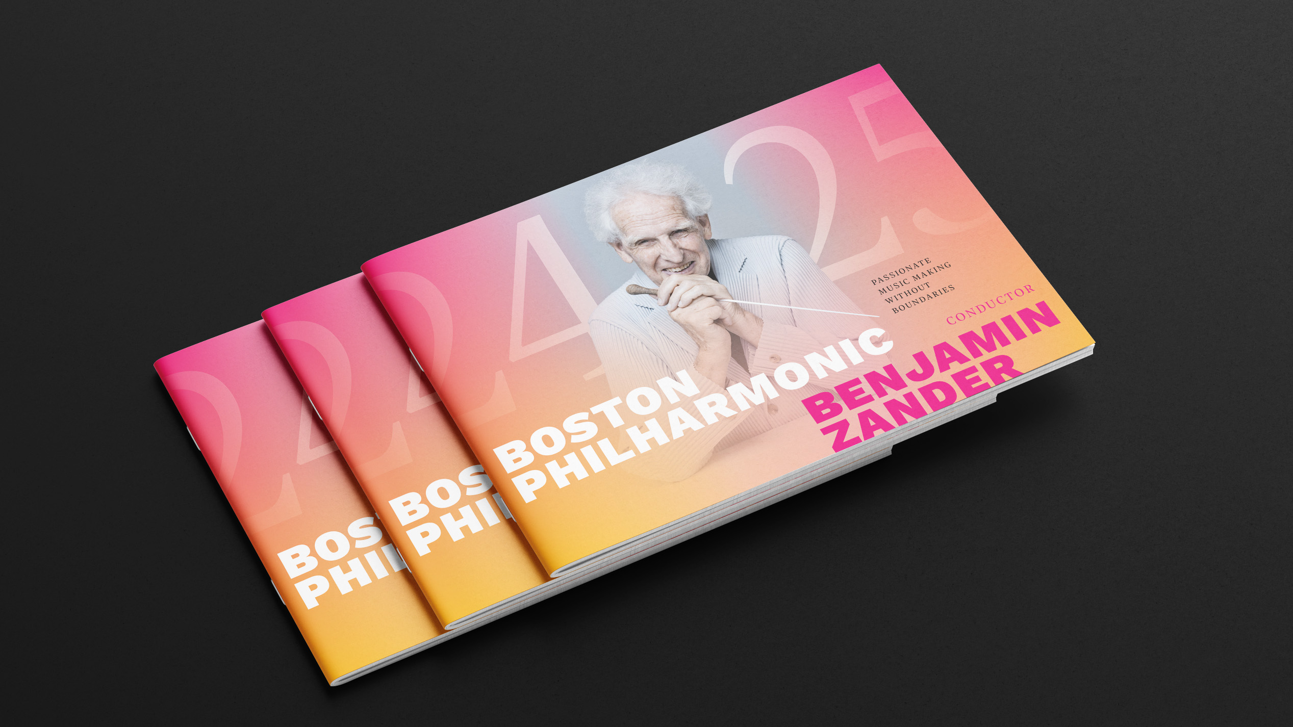
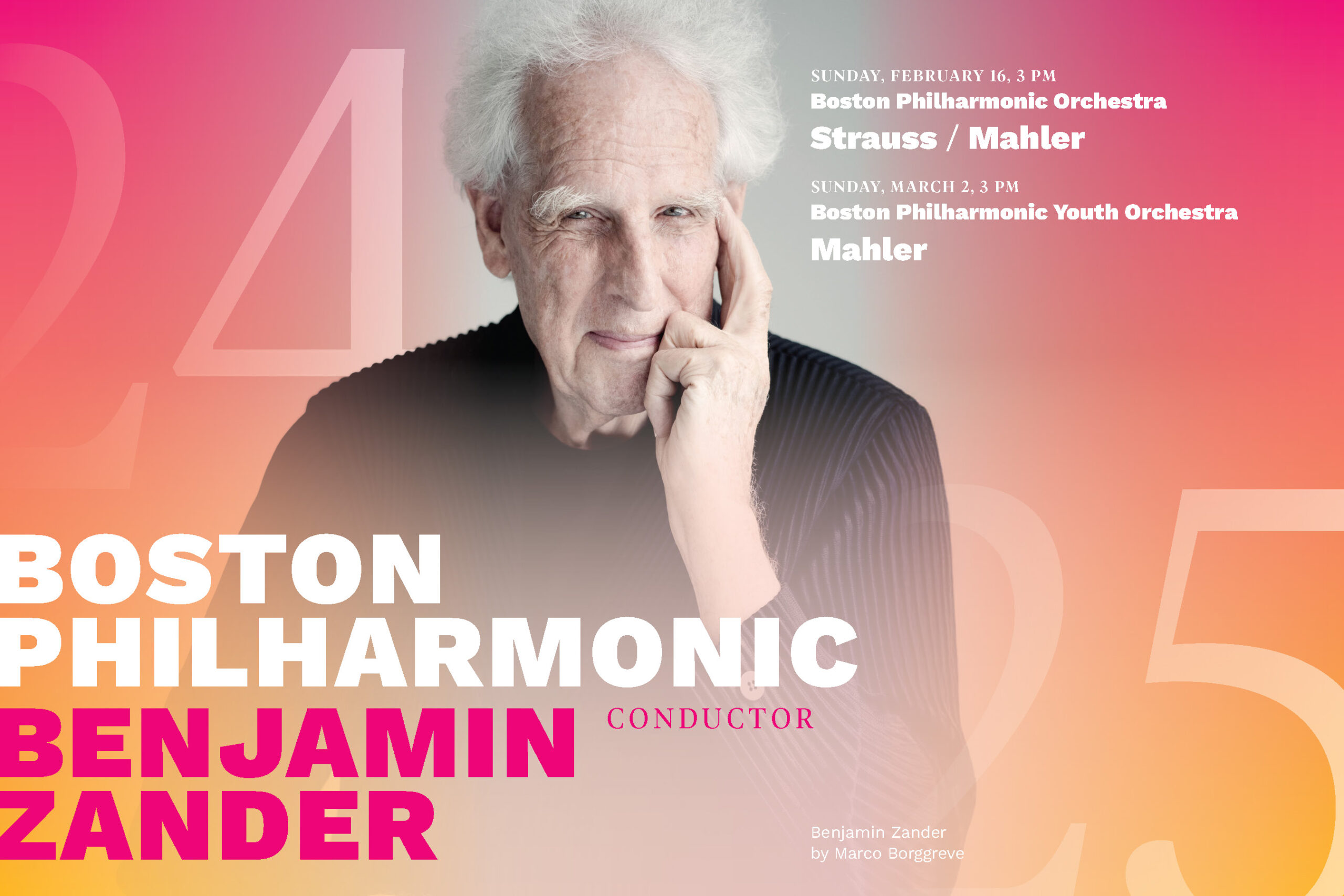
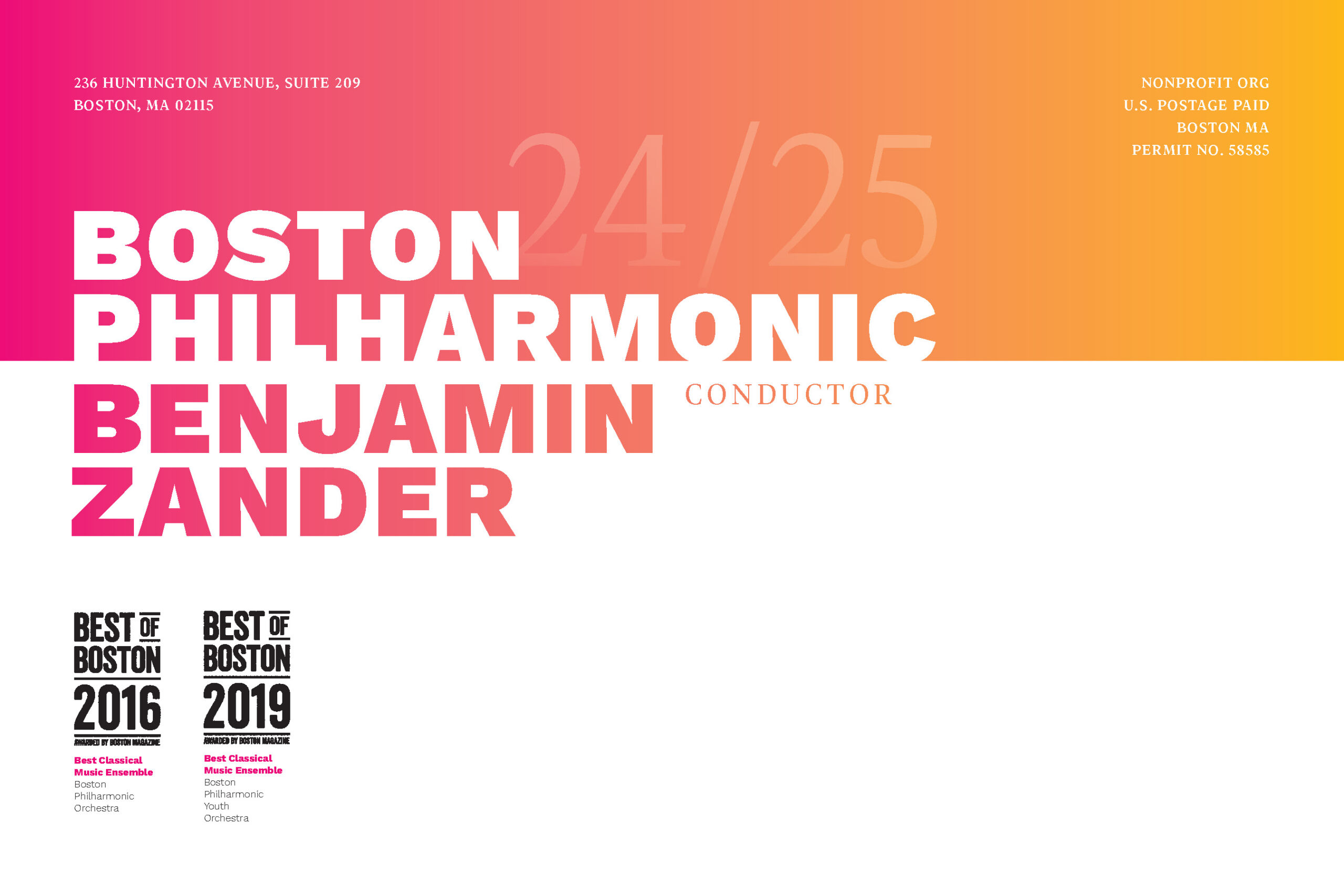
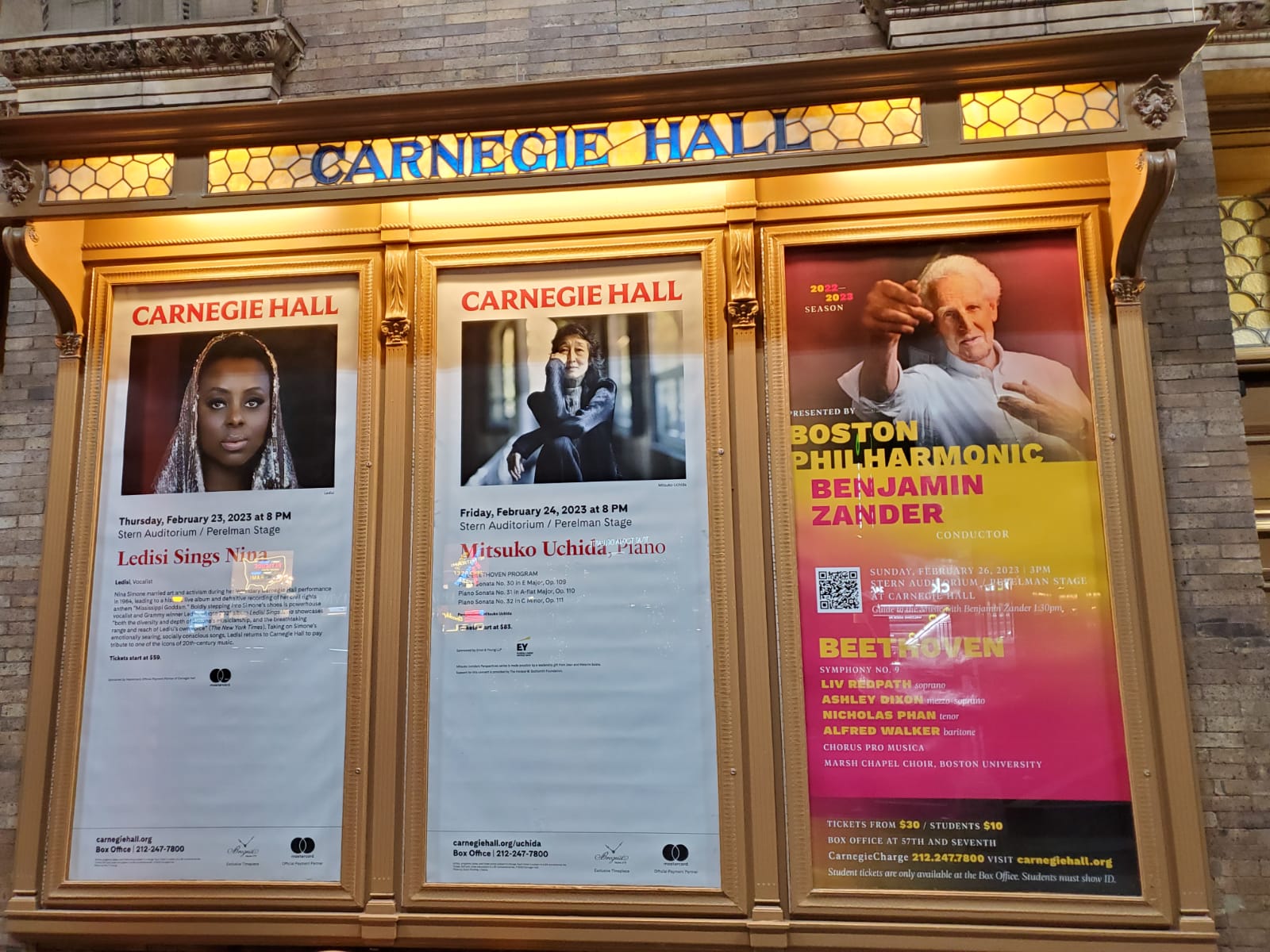
On my third year of working with the Boston Philharmonic, the 2024-25 season is well underway with a fresh new look. Every year the Philharmonic puts a spin on their vibrant color palette and typography and image treatment to give each season their own feel.
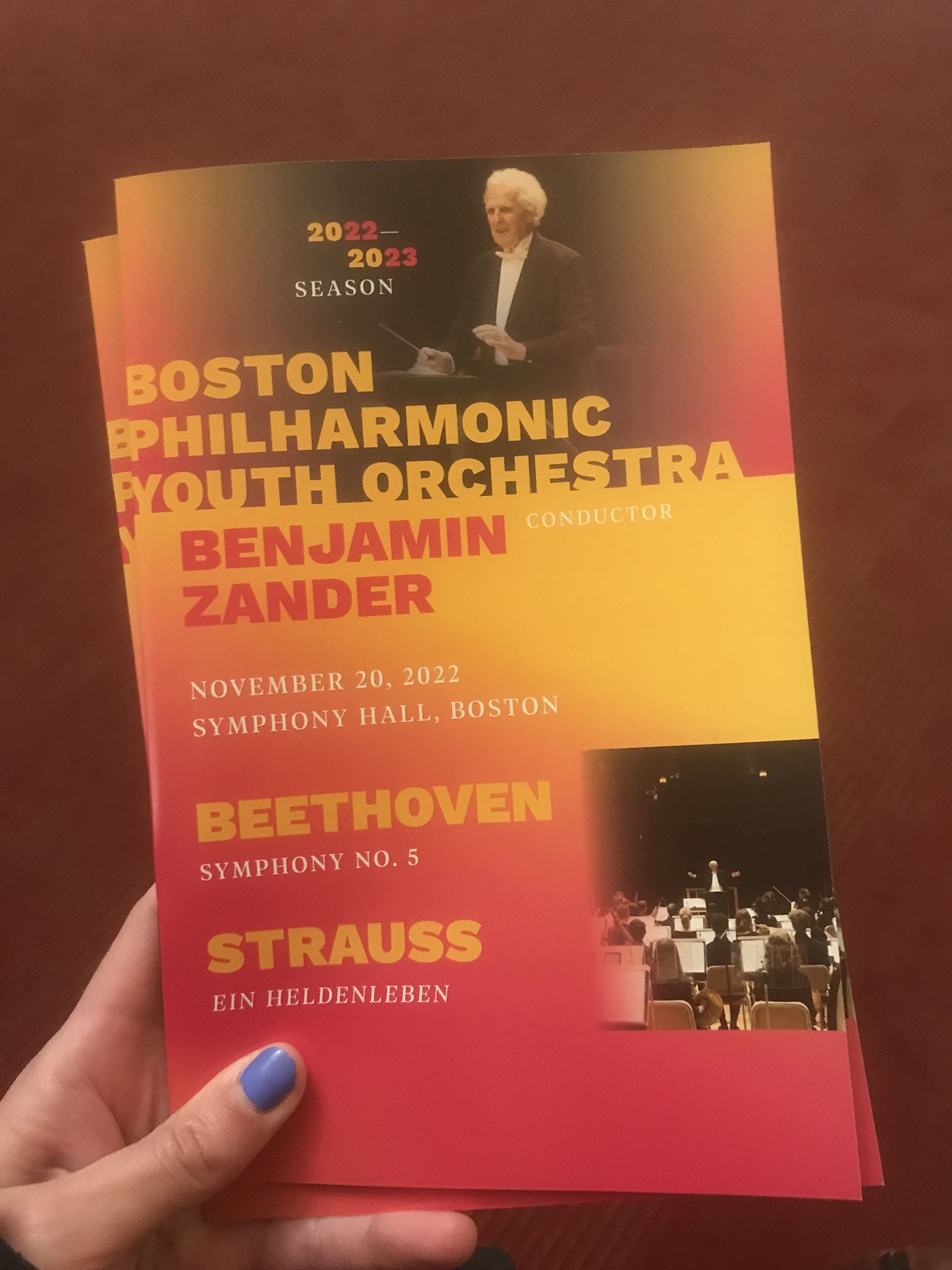
Past Season Brochure Covers
2024-2025 Season Brochure Cover
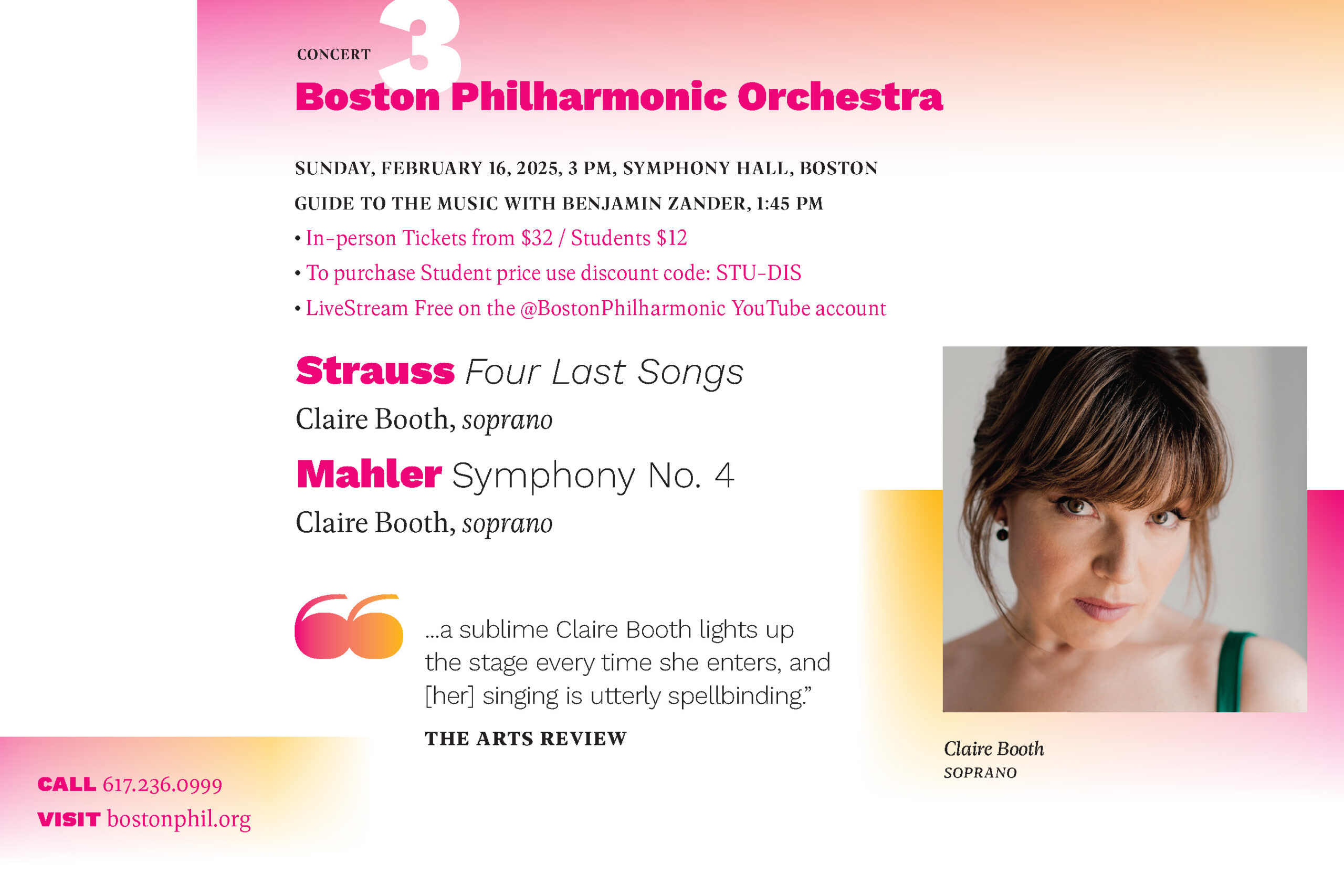
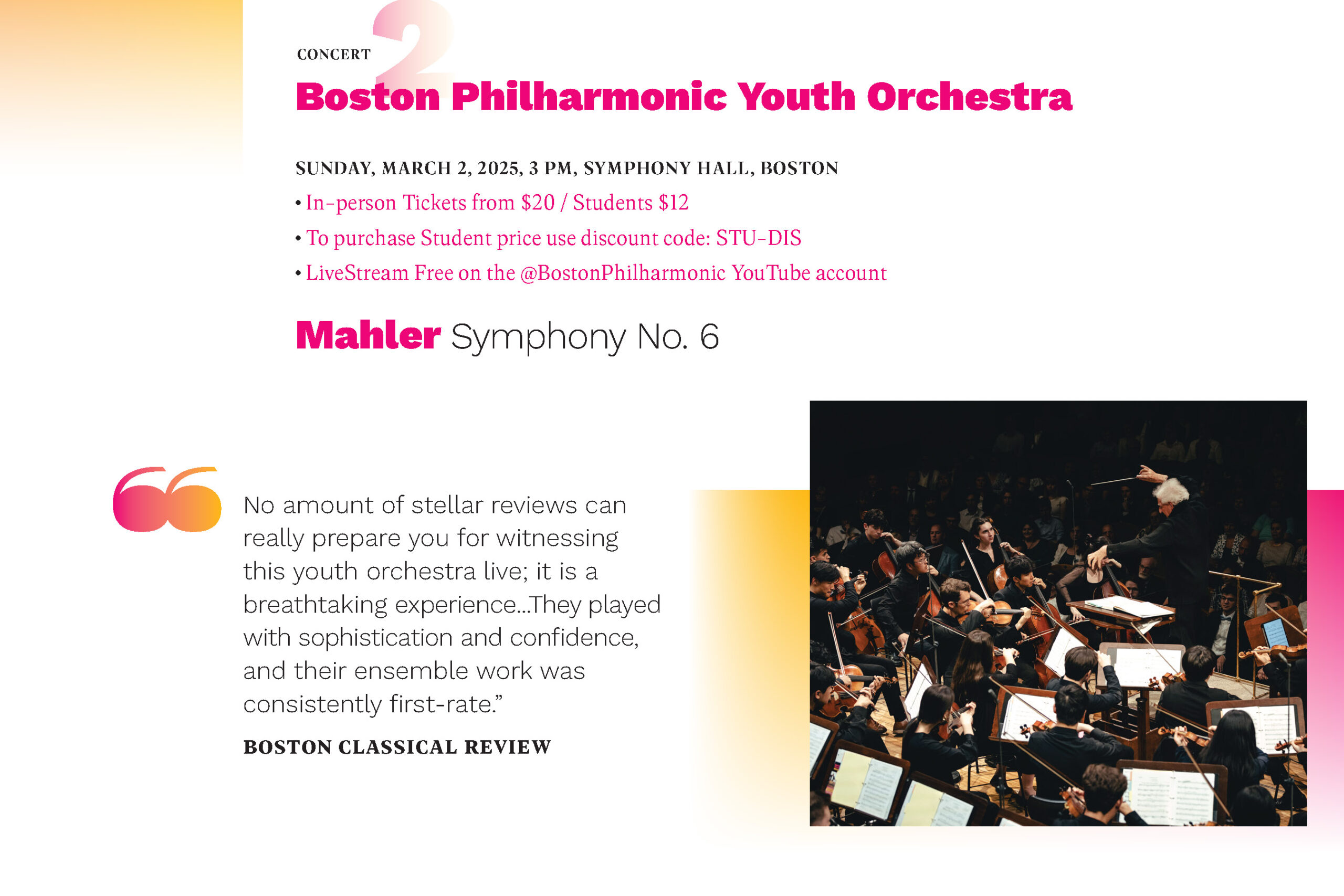
Seasonal Postcard
Takeaways
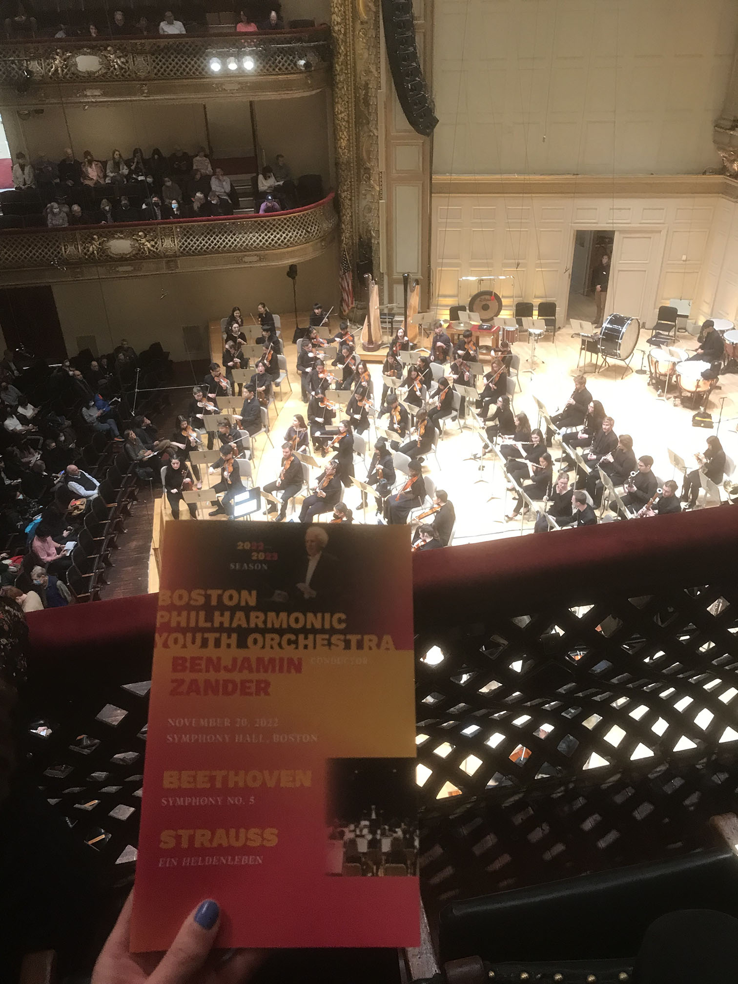
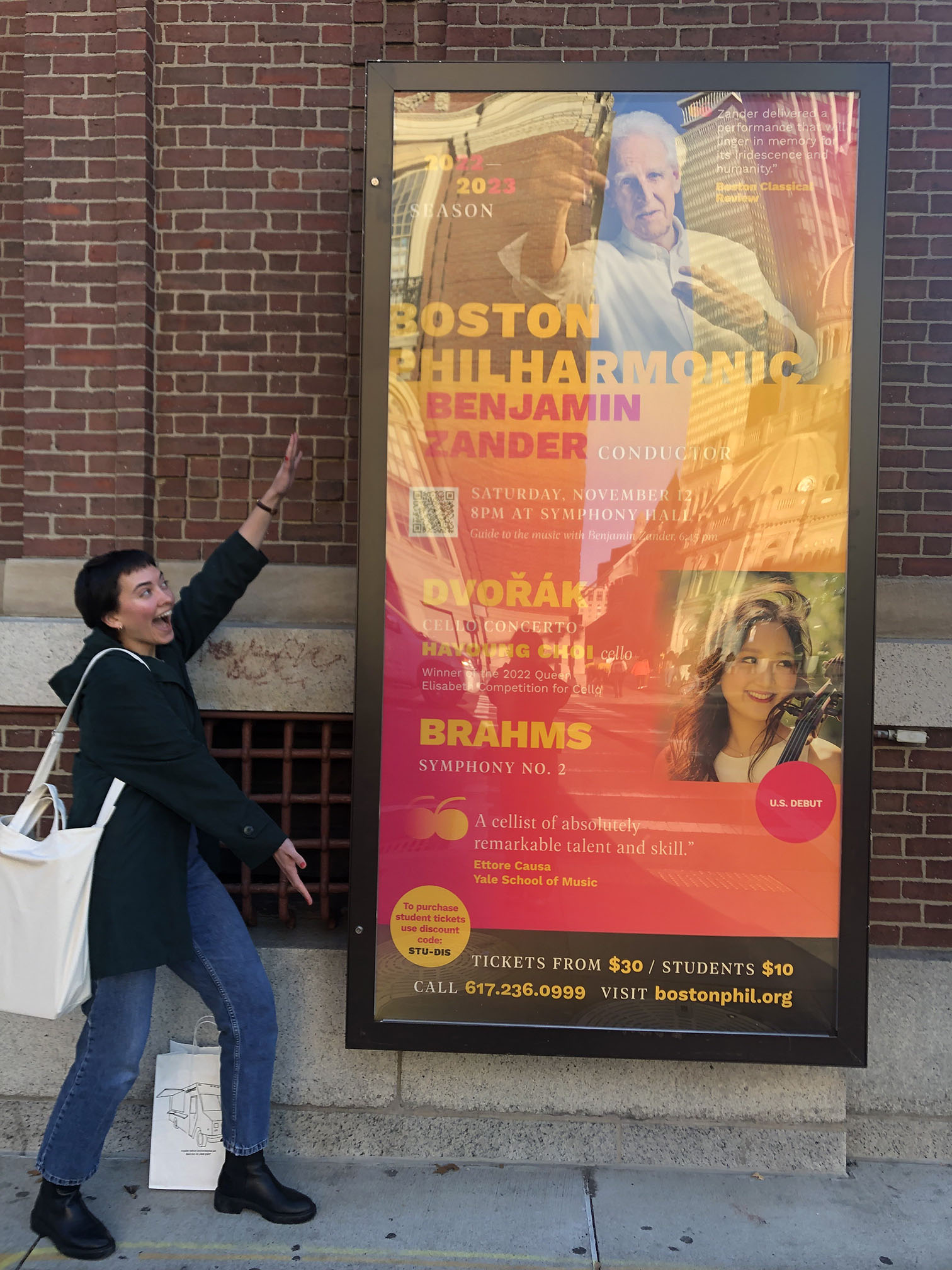
As my first and longest client with Sametz, the Boston Philharmonic has been one of the most rewarding projects to work on—especially since I am able to go experience my print designs in person (posters outside the hall, lobby signage, program books, seeing the concerts, etc!).
Featured Work
Jacksonville SymphonyIdentity, Print, Website, Video
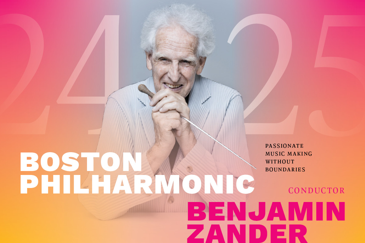
Boston PhilharmonicIdentity, Print & Digital Design
Rising Stars GalaIdentity, Print
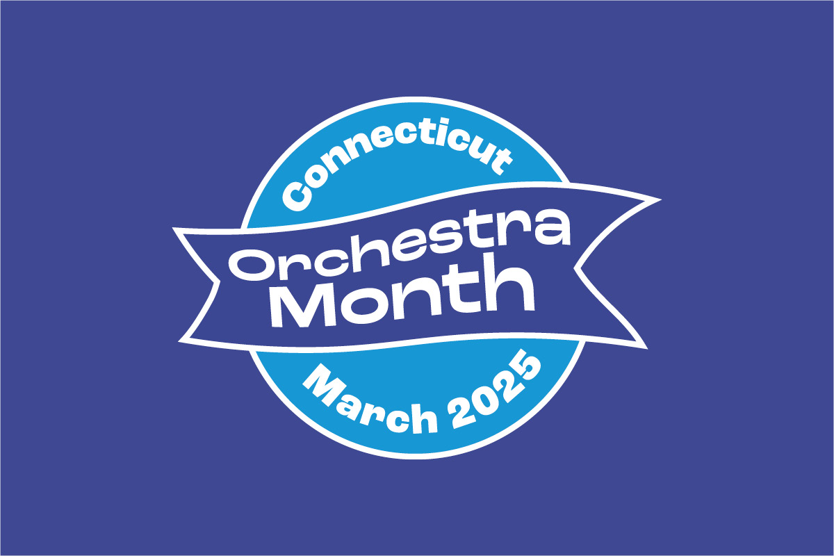
Connecticut Orchestra MonthIdentity, Website Design